Sunday, September 30, 2007

Card Sketch #24


Ok, here is the latest. In this one I used a lot of different layers. The designer paper is from Daisy D's and matted with cream cardstock. The circle layers are the same, and I used my mega and giga scalloped punches. The main image is from The Angel Company. I colored it using my prismacolor pencils and then I used OMS to blend the colors. This is one technique that I do a lot of, due to the great results that you can achieve with the blending of colors. This card looks a lot like the card on your right, except it has a diffent flower in it's center and more layers.


I fly out to San Diego tomorrow (Monday) for three days and then I finally get to go home for 2 1/2 days, before heading out to Minneapolis. My DH and faithful companion sure do miss me. At least that's what they are telling me :-). I know that I have a lot of laundry to do when I get home and a lot of packages to unpack. I ordered several more stamp sets from The Angel Company, the newest releases from Papertrey Ink and miscellaneous other companies. So, I'm sure that I'll have a lot of stamps to play with. I plan to stamp some images and take them with me on this next trip! I've got to get busy making up some other sketch cards so that I can continue to post while I'm on the road. Wow, is that a challenge in it's self. Have a great week everyone!

Wednesday, September 26, 2007

Card Sketch #23


Here is my latest sketch card. I've tried to mix up the sizes of my sketches to keep things interesting. This one as you can see, is square.

The card base is dark grey from Bazzill Basic's and the designer paper is from DCWV from their travel stack. I used some peel off's of leaves for the corners, stamped the left corner leaf (CTMH) with versamark and embossed with gold. The leaves in the bottom panel are stamped with Palette burnt umber and are from SU. The sentiment and the swirl are from The Angel Company, also stamped in Palette burnt umber. I thought the DP matched well with a lighter shade of grey from Bazzill, also. Since fall is upon us, I thought the pink tones in the DP reminded me of the shades of leaves as they start to turn color.


Well, I made it to Archivers and spent way too much money. I just love that store, so much to look at and choose from. I hope that one day they make it up to the Northwest. I also drove by a Hobby Lobby (we don't have these, either) and had to brake real hard to turn in. LOL...wow, is that a great store, too. I resisted spending money there, even though all of the paper was 50% off. I just didn't think that it would be able to fit in my suitcase for the trip home. You know those weight restrictions, and if I had bought all the paper that I wanted to, I would've tipped the scales. LOL...

Well, let me know what you think about this latest card sketch. I appreciate any and all comments!

Sunday, September 23, 2007

Card Sketch #22


Here is my latest sketch. This one is pretty straight up, and good for any occasion. I used stamps from the Angel Company, the main image is from Swirly Gigs and the sentiment is from Rose sentiments.

The main image is stamped on acetate with Palette Noir and then colored with a red glaze gel pen. I attached it using Beacon's 3 in 1 glue, which is an all around great clear fast drying glue. In real life this matches the Burgundy cardstock really well. The sentiment was stamped with Memories black ink and then embossed with clear embossing powder.

The designer paper is from K&Company and the Burgundy cardstock is Bazzill Basic's. Ivory cardstock was used for matting and the ribbon is ivory grosgrain.


I'm still in Denver doing my training stint. I didn't bring any stamping supplies with me and I'm going through with drawls something fierce. I have a day off tomorrow, so I will be hitting the local Archivers. We don't have any of these stores in Washington State, so I thought I'd check them out while I was here. Maybe I'll pick up a few things to keep me busy until I get back home. You know, you can only do so much studying and work......YKWIM ???

Tuesday, September 18, 2007

Card Sketch #21


Hello from the beautiful state of Colorado. I'm here for a 14 day training stint and brought my laptop (which is work related) and my flash drive (which isn't) that I pre-loaded my sketch designs and cards into before I left Seattle. Glad to leave the rain behind for the sunshine and 80 degree weather here.

Ok, here is sketch number 21. It has lots of possibilities, but I went a little nuts with the red and white dots. You see, I've had this paper for it feels like forever, and decided to finally use it. I wanted to do something with it for Valentines day last year, but it just wasn't coming together for me. Now, I think it works, sorta.


The rose is colored with prismacolor pencils and OMS and is from The Angel Company. I used my circle punch to punch out the rose and then cut a scalloped circle out of red cardstock and added some dots around the perimeter using my white gel pen. Then I used the giga scalloped punch and added the red dots using my red glaze gel pen. I popped both scalloped circles up with dimensionals. The red ribbon down the side came out very dark in the picture but everything does coordinate in a red and white sort of way!

Hope everyone has a great week!

Monday, September 17, 2007

The Winner is......

The winner of my blog candy is: Shannon Roberts!

Shannon said: Congrats!! Luvin the paper & the snowman! I am gonna get started on Christmas this weekend & thanks for the inspiration!!

Shannon, send me your snail mail address and I'll get out to you the following candy pictured here: Congratulations!

Thursday, September 13, 2007

Card Sketch #20 and Blog Candy for 5000 hits


Wow, I can't believe I'm close to 5000 hits! So, I'm going to give away some Angel Company stamps and other goodies to one lucky person who leaves a comment on this post. Winner will be randomly drawn on Monday morning.

This card was done with Christmas in mind, since it'll be here before we know it. I dug into my SU Christmas papers for the base of this card. The red side panels were stamped in versamark with the circle sampler from TAC since they were a pretty good match!


The main image of the snowman is an old Gift With Purchase stamp from TAC. I colored it with my prismacolor pencils and OMS. I mounted him up on dimensionals, added a red square and distressed the blue panel. It was a pretty fast card, and the sketch is one that has a lot of possibilities. Enjoy and good luck to everyone on the blog candy!

Monday, September 10, 2007

Card Sketch #19


Have you ever done a piece of art work for a card, but it just didn't fit? Then put the piece away to do something with it at a later time? I have several piece laying around like that! This is one I did a while ago, when I got my first set of alcohol inks. I was playing around and doing a bit of embossing resist and this is what came out. I actually had three dragonflies on here at first, but had to cut one of them off to fit this sketch. Ya, I know the rule of three, but this has to be an exception to that rule....:-)

Stamps used: The dragonfly stamp is from Stamps by Judith (I've had this stamp forever and it's one of my favorites...I just love dragonflies) and the sentiment is by The Angel Company.

Alcohol inks used: Lettuce and pesto blended with the blending solution.

Cardstock is from Bazzill (olive green) and DCWV (black). I inked the edges of the sentiment so that it would stand out a bit. I did a bit of paper piercing in the corners to add further dimension.

Inks used: Palette Noir and Versamark
Clear embossing powder

Thursday, September 6, 2007

Card Sketch #18


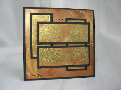
Wow, what a week so far! I have spent the last three days working my caboose off. Nothing like working 40 hours in three days! Glad I designed this sketch and made the card last weekend, because I sure don't have the energy to do anything with it right now!

This is one of my favorites so far! I just love how it turned out as I was playing with my alcohol inks! It's so metalic and fall looking!

I used caramel, ginger, latte and gold alcohol inks to color the panels and toned it down with the blending solution on glossy white card stock. I then stamped my image in versamark and embossed them with fine gold ep. I also embossed the edges of the two vertical background panels. The background 4x4 piece was stamped with versamark and embossed with clear ep (stamp is flourishes from TAC), and then I used the alcohol inks to color the whole panel. I matted it with black card stock and then added the paper piercing to the finished product.

Stamps used: TAC flourishes and CTMH Autumn Splendor

I would love to hear any comments you have on this one! TIA !

A different take on sketch #17

This take on my card sketch came from Samm, check it out here!

Tuesday, September 4, 2007

Card Sketch #17


Imagine....It's September already (can you believe it?)! Where does the time fly? Summer was over way too quickly for me! However, I do enjoy the colors of fall and they seem to be coming in rapidly.

Here is a small square card sketch (4x4) that was fun to whip up.

Background stamp is the new SU sanded, done with Palette starry night ink. I used a flourish stamp from TAC and stamped it in versamark and embossed with clear ep. Then I sponged on some Palette starry night and matted it on dark blue card stock. The imagine sentiment is from TAC and stamped with the same ink. The faint butterfly is stamped in colorbox ice blue (stamped off once) and then embossed with clear ep. I cut out a thin cuts hinge (sizzix) from the same blue card stock and added it to the end of the horizontal piece, which I also distressed with Palette starry night ink around the edges. So, it's definitely a blue on blue card! Double click on the card to see the faint butterfly. You might have to look hard (LOL), it's a lot better in real life!

I did another small square sketch that I'm really excited to show you all later in the week, so stay tuned!